
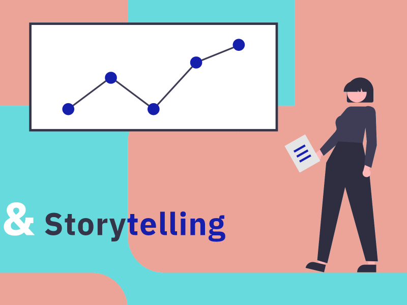
Data & Storytelling: Understanding data, telling stories
A series of events for doctoral candidates and those interested
Date:
26.11.2025 bis 23.01.2026Place:
All events will take place online via Zoom.
Important: Registration for each individual event is mandatory in order to participate. You will find the respective registration link and all further information on the corresponding event pages.
Categories:
Event, WorkshopContact:
Johanna KonstanciakFurther Information:
HERMES WebsiteData is often referred to as the gold of the information age. Accordingly, data visualisations are becoming increasingly relevant — especially in the humanities and cultural sciences. These range from simple bar charts to interactive and exploratory visualisations. In this series, consisting of three lectures and a practical hands-on session, we will explore this exciting field from different perspectives: The lectures range from types of illustrations and design principles to insights into journalistic practice and image science considerations on the epistemic character of data visualisations. The series concludes with a workshop where you can finally give it a try yourself.
Making data visible — Fundamentals of effective visualisation
A lecture by Dr Emilia Kmiotek-Meier
November 26, 2025, 6-7.30 p.m.
In this interactive session, you will learn the basics of effective data visualisation — from choosing suitable chart types to optimal design. You will learn how to convert complex data into understandable graphics while avoiding common presentation errors. The focus is on the technical and design aspects of quantitative data visualisation. Feel free to bring your own examples.
Further information & registration
Data storytelling in journalism
A lecture by Anna Behrend
December 3rd, 2025, 12-1:30 p.m
How do you tell data-based stories in an engaging and understandable way for a broad audience? What skills do you need for this? And how do you reduce complexity without oversimplifying? These questions are discussed using examples from everyday journalistic life. An insight into the work of SPIEGEL's “Data and Visualizations” department shows an example of how journalists, programmers and designers work together to research and implement data-driven stories. An overview is also given of which (further) educational paths can lead to data journalism.
Furhter infromation & registration
Visualization as a means of knowledge — Exploratory and narrative approaches for data-driven research
A lecture by Dr.Linda Freyberg
December 12, 2025, 10-11:30 a.m
In this lecture, the theoretical foundations of visualization at the character level will be presented and a definition of information visualization that focuses on its epistemic function will be given. What follows is an overview of data-level visualization workflows, particularly current tools and software. Finally, current examples of exploratory and narrative data visualizations are presented and discussed.
Further information & registration
Data Visualization with Python for Statistical Inference and Storytelling
A workshop by Dr.Golnaz Sarkar Farshi
January 23, 2026, 9 a.m. to 2 p.m
This workshop is designed to provide participants with three essential skills: You will learn how to create data visualizations for data storytelling using the Seaborn Python library. You will also learn about the concept of statistical inference and understand how it can both help predict non-existent values in the data set through data visualization and make it easier to understand certain machine learning techniques.
The workshop is based on the following open source lesson developed by Golnaz Sarkar Farshi:
No prior knowledge of Python or pre-installations are required for the workshop. We will be working in a Jupyter notebook deployed in the cloud.
Topics: Promotion of Young Talents
Projects: HERMES